Kindness, friendliness, and humanity in design
Faced with seemingly impassable obstacles, we find solace in rote positivity. Living in, generously speaking, tumultuous times, we look for hope where ever we can get it. In response to this, brands have become friendly. All smiles, and cute emojis in your bank’s notification saying that you’re late on payments.
The role of the designers in all of this is to placate? to inspire? to follow societal tendencies, wherever they may lead?

Historical Background
A good story always stops in its tracks to give you half an hour of exposition (so that you could get nice and bored, and then when the things pick up again, it’s all the more exciting). In the first half of the 20th century, the design was machine-centric and futuristic: praising ingenuity and engineering, looking forward into space. In the aftermath of the worldwide trauma of the war, the 60s demanded to have hope again, to feel joy. In graphic design, the most telling example would be the album covers: barely existent as a form previously (usually the photo of the singer with the track list next to them), they’ve become colorful and often psychedelic in the 60s. This excitement somewhat continued through the 70s, but was cut short later on. Depending on where you look, the 80s were either drab and mournful, or entirely too garish.

Inclusive and Accessible Design
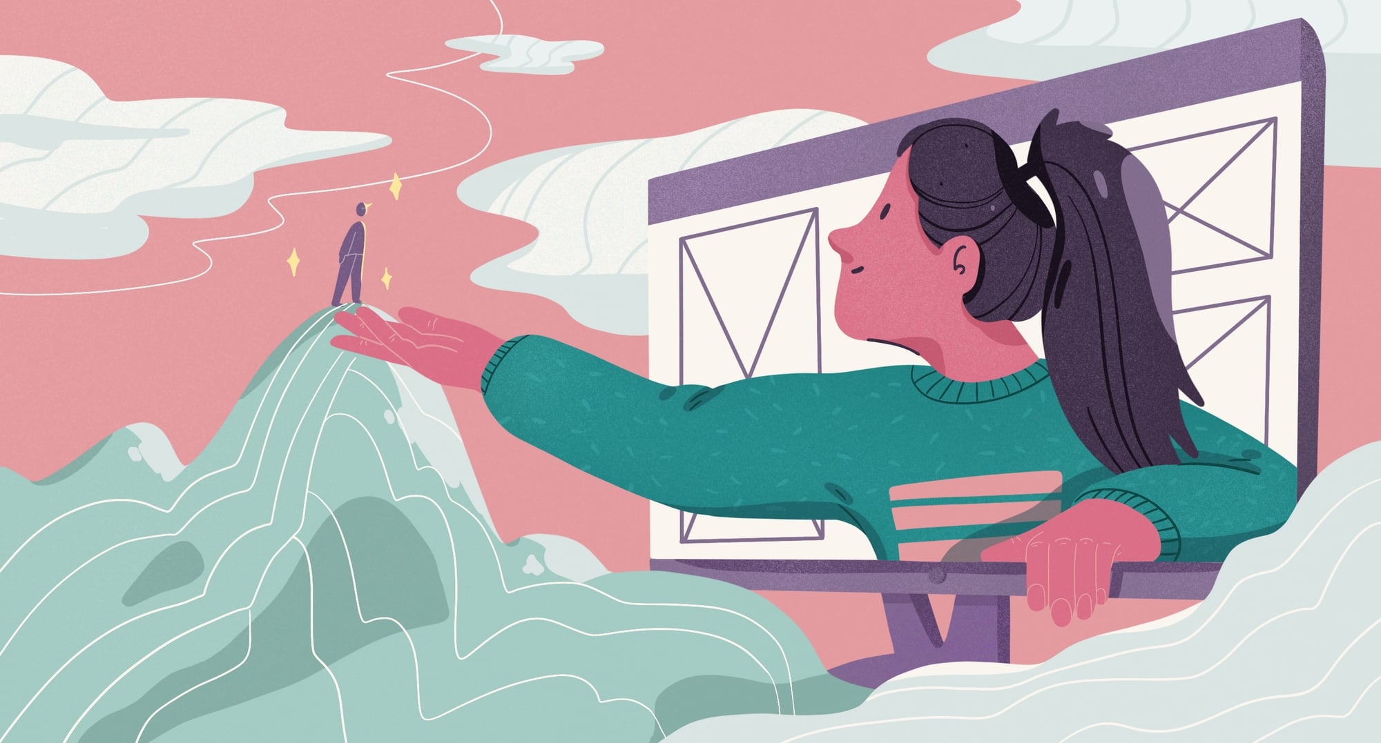
The whole trend isn’t just pretty colors and adorable drawings. It’s a massive shift of the focus in design. It’s now unquestionable and self-evident that digital spaces have to be inclusive and welcoming to everyone. Up until a few years ago the web designers didn’t even check whether a website is readable for the colorblind, which is, luckily, no longer the case. Websites are properly structured to be accessible for screen readers, websites are optimized and so can be viewed in the areas that still have poor internet connection. Web is now for everyone, all due to empathy.

What’s Next?
Be advised: this part of the article is pure speculation. Founded in reason, but speculation nonetheless. We can’t predict the future.
The shift to focusing on the emotions isn’t going away anytime soon, as well as making digital a welcoming place to everyone. However, this current friendly iteration is going to be history in two or three years, tops. It’s already getting tiresome to those in the industry. So, what’s next?
If the history rhymes with the 80s again, what comes next is the stark divide between the gloomy and the gaudy. We don’t mean that the 80s nostalgia is going to be the trend: you can rest safely, knowing that everything won’t suddenly look like Miami Vice. And we’ve already had an 80s retread quite recently, with brief and localized trends on cyberpunk and neon. What we mean is that on one hand, the needed emotional response will be achieved with unexpected clashes. E.g. the use of traditional media and fine art in digital, vibrant colors, and more to come. Things to bring out emotions and empathy, but aren’t necessarily friendly in the purest sense of the word.

It Takes Strength to Be Gentle and Kind
Designers aren’t politicians to give empty platitudes on remaining hopeful in the darkest times, et cetera. But designers do have a responsibility: a good design is something more than just functional and pleasant on the eyes. A designer should keep in mind not only the final user, but the audience at large. Good design is honest and empathetic.
