Ilab Optical

Brand identity
I-lab aims to be the one-stop-shop for optical glazing in Mauritius. We designed a logo that puts the emphasis squarely on vision.
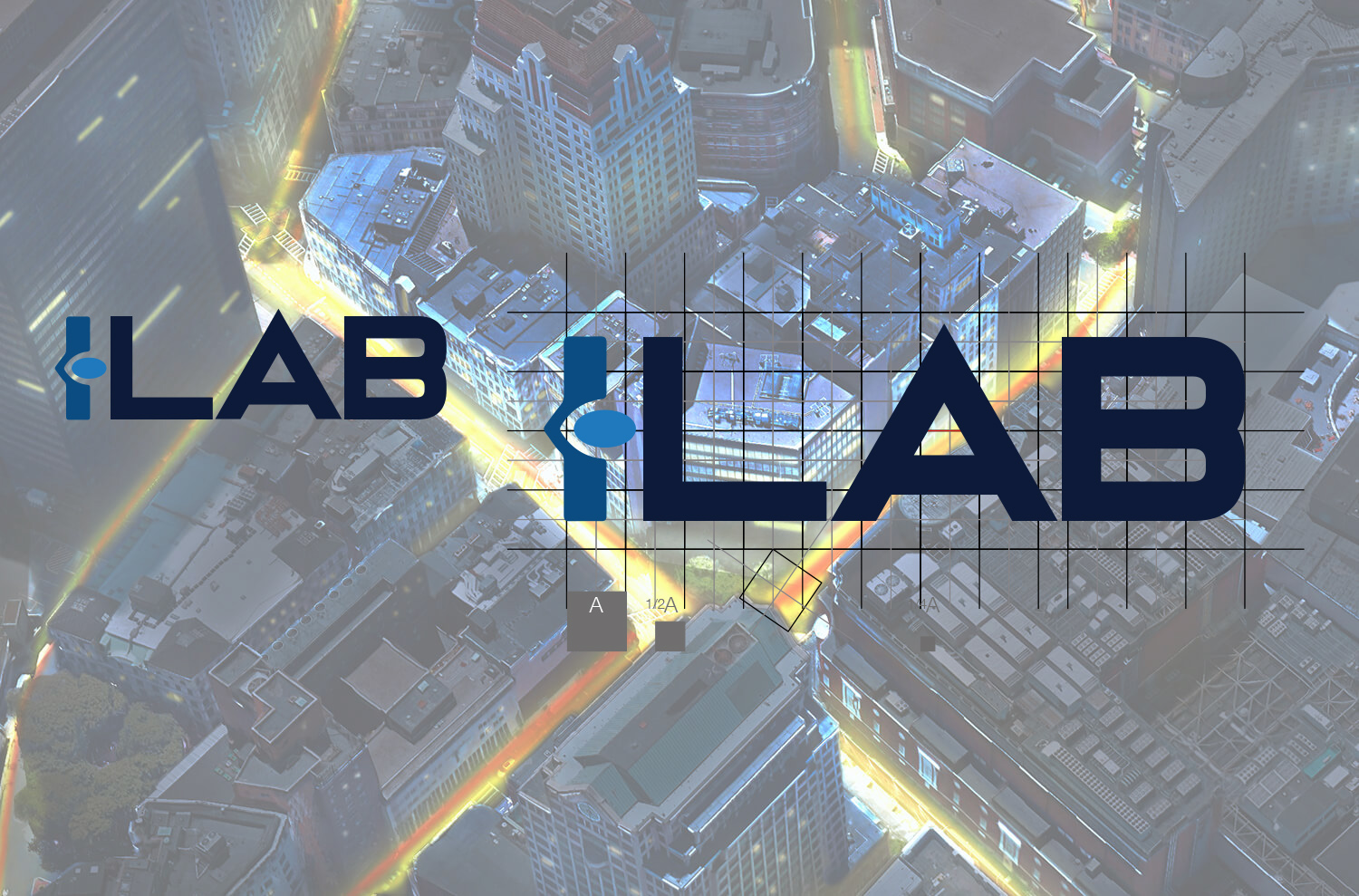
The brand identity is straightforward while also incorporating subtle references to the business expertise and anatomy of a frame: the eye shape intersected between the I acts as a frame temple and represents the business vision.
The sharp-edged typeface showcasing the precision of craftsmanship all together making a modern, bold and iconic wordmark that is easily recognisable and applicable across all materials.


Concept of the brand
It’s often challenging to design a unique identity because there are so many brands around; however, experienced and talented designers can find ways to create distinctive logos.
Our client requested the brand identity design for a new optical glazing company. It was expected to be a classy, distinctive and modern logo for the company profile to correspond to the peculiarities of the target audience.
The creative process of branding for ILAB set off with logo sketching. It started with the brainstorming and analysing client’s vision of a new symbol as they wanted a modern logo, bold and still simple with abstract elements. The client also asked to keep a blue colour palette as it corresponds to their vision of the brand image.
With both parties in agreement on the direction to follow, we started the creative process.
The first stage was a sketching technique applied to visualize the first ideas on the paper. Such an approach allows for picturing various concepts without significant efforts and within a short time. Besides, sketches make communication much more effective in helping clients and managers to understand designers’ ideas. Here are illustrations for ILAB logo.
We experimented with vector forms trying to illustrate an eye subtly. Flat vector graphics gained a vast popularity a long time ago and remain one of the basic directions for logo design. Simple geometric shapes are elegant and transparent, so they are pleasant to our eyes. Considering all the aspects, we created several variants in an abstract style followed by the wordmark.


final outcome
We completed the logo in flat minimalistic style. A fusion of an eye illustration and a word-mark.
The Psychology of shapes states that our mood can be changed according to the shapes we are looking at, shapes applied in symbols have a significant influence on a human mind. The eyes are usually associated with clarity and vision so such a frame may work effectively for the positive brand image.
We chose the colour palette according to the clients’ expectations. The variant of light and navy blue colour gave the feeling of stability. The slight gradient made the logo more playful and modern-looking, which responded to a current brand strategy—also, a monochromatic variant as an alternative in cases when the primary colours cannot be applied.
As mentioned earlier, designing a unique brand identity can be quite challenging for even the top professionals, however, creativity and communication with clients can make this process productive and easy.
Head of PM: Ayodele Akinyele
Brand Design: Ayodele Akinyele


