The challenge was to take an established Mauritian family business MAFTA and revitalize the brand identity to make it modern — to communicate not only to the market and consumers but to existing and the new staff, the MAFTA employees — to create something new and fresh for the Mauritian market. It was about being green, recycling, and purple. Whatever the logo looked like, it had to speak to the community, be holistic, inclusive, a 360 solution, and nurturing. We needed to create something that could permeate and amalgamate two distinct values across Mauritius. A ‘oneness’ was critical, a sense of uniting the brand’s and customer’s needs, being one entity with people inextricably at our core.
Solution
The brand design has been about what’s behind the logo: the entire brand experience, new business strategy, and Clean and Green’s move to add value to waste. At the same time, it has to work well on bins and trucks as part of the operational elements of waste management. Most important is that Clean&Green is a proper Mauritian Company, built through family and philosophy, to add value to waste and consider what its customers need. An entire visual set drives and supports the logo’s meaning, a visual language. We want the logo to be a word, not an acronym. We want a dynamic brand identity, fully integrated, a logo that comes to life, not an icon sitting in a corner.
Steeped in symbolism
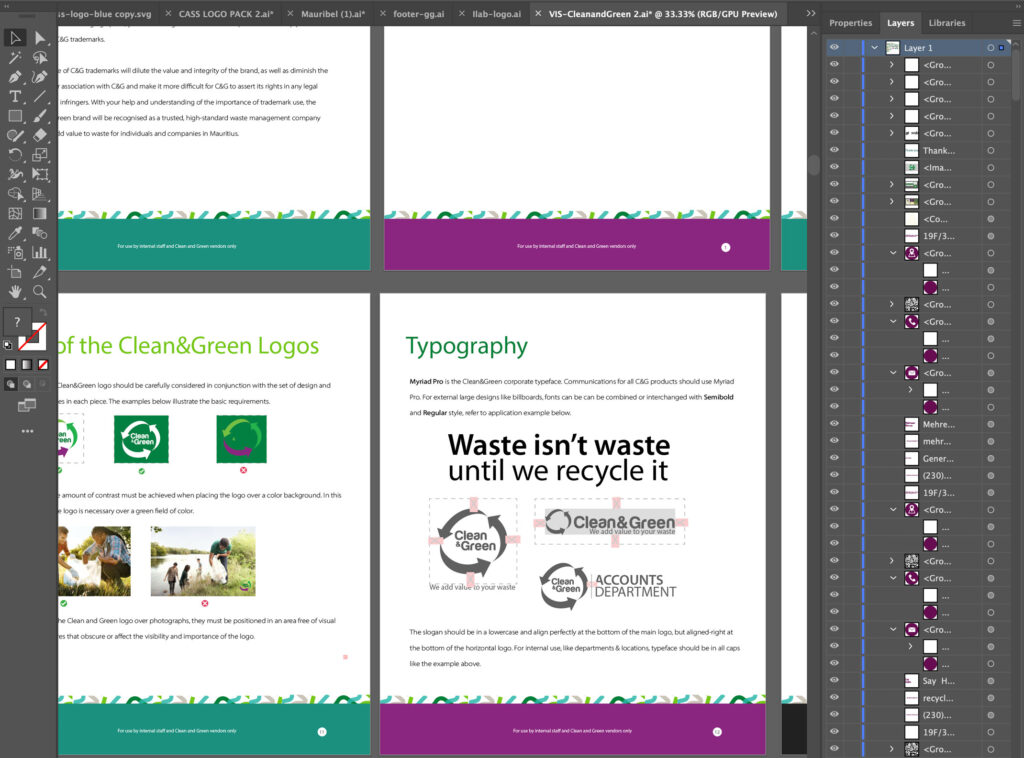
The Clean&Green typeface is the modified premium font, Harabara Mais. The circle is dynamic and vertically stacked with the lower-case “Clean&Green”. While put to use as a warm, embracing frame for the new logotype, the oval arrows are steeped in symbolism.
The business may be understood as an almost infinite number of parts — green, recycle, people, planet, environment, teams, individuals, families, relations, communities — all arranged around our philosophy and a common goal: to add value to your waste. As part of the rationale of catering to an audience as geographically and culturally diverse as Mauritius, we’ve sought a communications solution removed from language and syntax yet still capable of creating, conveying and deepening the meaning of our messages.
A brand is about more than a logo; it’s about how you make people feel. We need to have these conversations around design, about what it is and how it looks and acts: it needs to mean something. The Clean & Green Brand has been unprecedented in the number of touch points needed to be considered from an experience point of view. We looked at all brand assets: from how customers use the bins to the WMS, Recycling symbols and colours; vans; caps; T-shirts, polo the brand overlay on the physical materials and digital interfaces; brochure holders; stationery assets; billboards; and the web interface.
Head of PM: Ayodele Akinyele Brand Design: Ayodele Akinyele Motion: Adil Baguant